2018-03-01 分类:行业资讯 阅读:
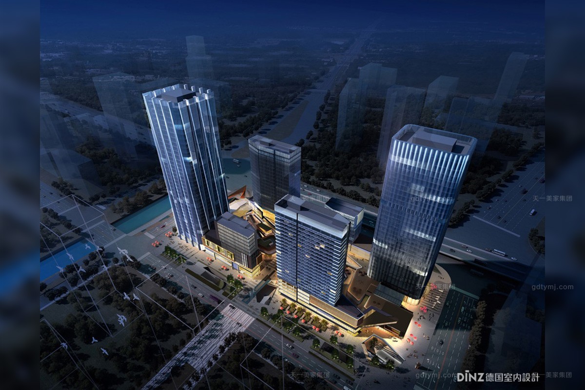
保利鱼珠港项目正位于位处广州“东进”战略-黄埔临港经济圈最核心位置,以构建广州比肩世界的城市港湾为使命,保利鱼珠港的定位为集居住、商业、娱乐、办公于一身的优质城市综合体,涵括了奢华型酒店、超甲级写字楼、大型购物中心、小区购物等,是保利集十年综合体开发经验的重量级作品。此次设计为北区A2塔楼办公销售中心,涵盖创意办公、超甲级写字楼以及公寓为一体的展示空间。
Poly Yuzhu Port project is located in the core of Guangzhou "Look East" Strategy - Huangpu Port-centered Economic Circle, it takes the construction of world-comparable urban port in Guangzhou as its mission. Its positioning is a high-quality city complex integrating residence, commerce, entertainment and office. It covers the luxury hotels, super Grade A office buildings, large shopping malls, residential shopping, etc.. It is Poly's key work integrating 10 years of complex development experience. The design covers North Tower A2 office sales center, including the display space integrating creative office, super Grade A office buildings and apartments as one.
针对此办公销售中心项目的整体效果设计,设计师抛开传统办公照明追求照度,均匀度的绝对值的所谓限定,融入酒店照明的设计手法以及视觉感受,将空间照明的色温、亮度、均匀度等进行重新思考与应用,手法极简,但内容丰富,凸显出空间设计的独特气质和精致品位 。
Considering the Overall effect design for this office sales center project, designers put aside the so-called limitations, such as the traditional office lighting pursues the absolute value of illumination and uniformity, integrate the design method and visual perception of hotel lighting, reconsider and apply the color temperature, brightness, uniformity of the space lighting, etc., use minimalist method and rich content to highlight the unique temperament and refined taste of space design
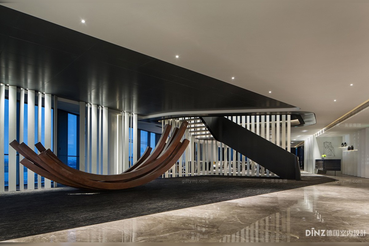
销售接待区正对电梯厅,室内的设计手法融合龙门吊、铁轨等工业遗迹,并与前沿的建筑形式重新融合,焕发空间新的生机。灯光设计中,设计师延续室内设计视觉的新鲜感受,采用背光手法照亮立面竖型白色屏风,与工业感铁锈艺术品形成剪影效果,空间黑、白、灰三个色调浑然一体,灯光也成为空间材质的一部分。
The sales reception area just faces the elevator hall. The interior design method integrates with industrial relics such as gantry cranes and rails, and reintegrates with the frontier architectural forms to rejuvenate new vigor of the space. For lighting design, designers continue the visual fresh perception of interior design, use backlight to illuminate the facade vertical white screen, form a silhouette effect with rust artworks with industrial sense. In this space, three tones of black, white and gray blend together well and light also become part of space material.
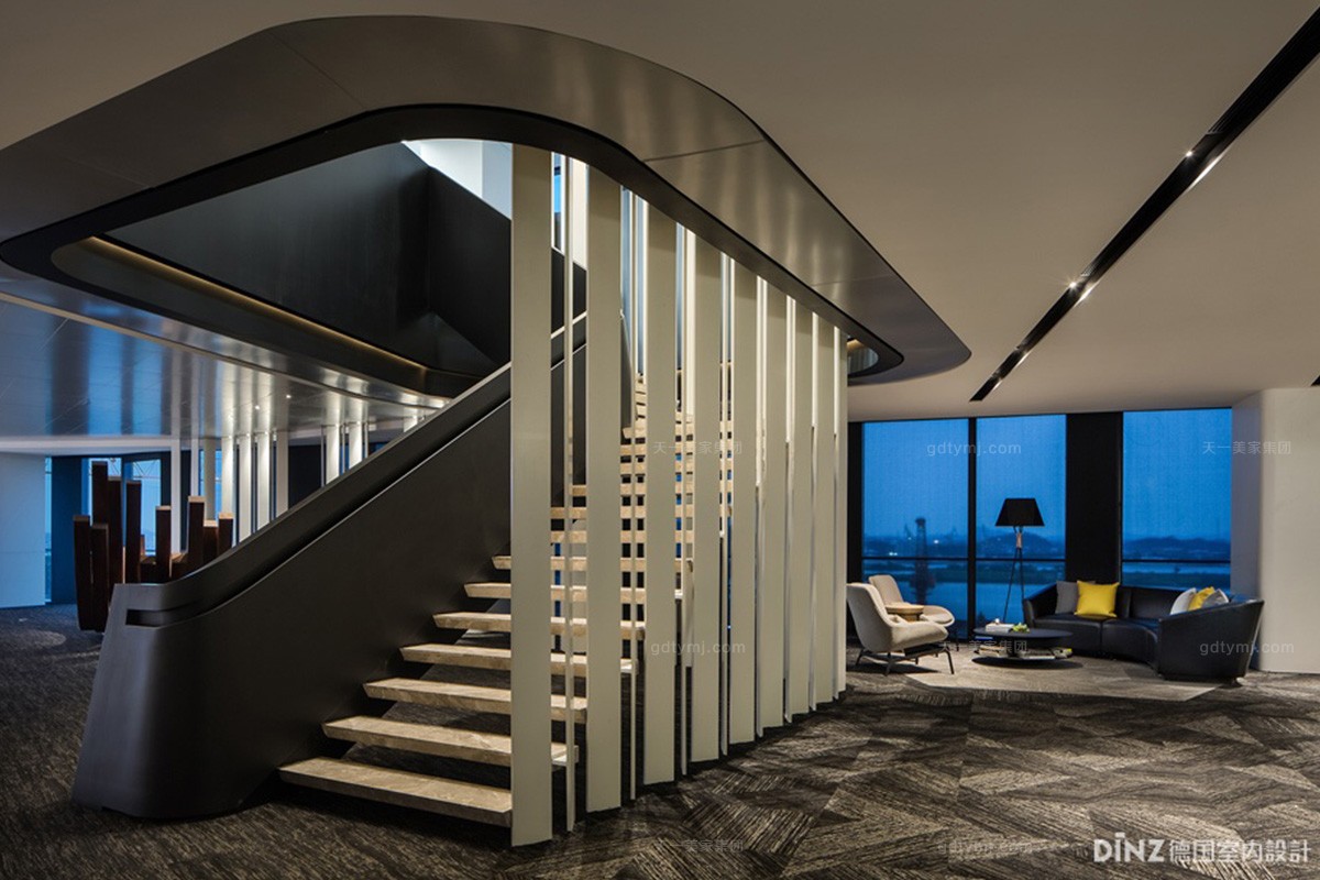
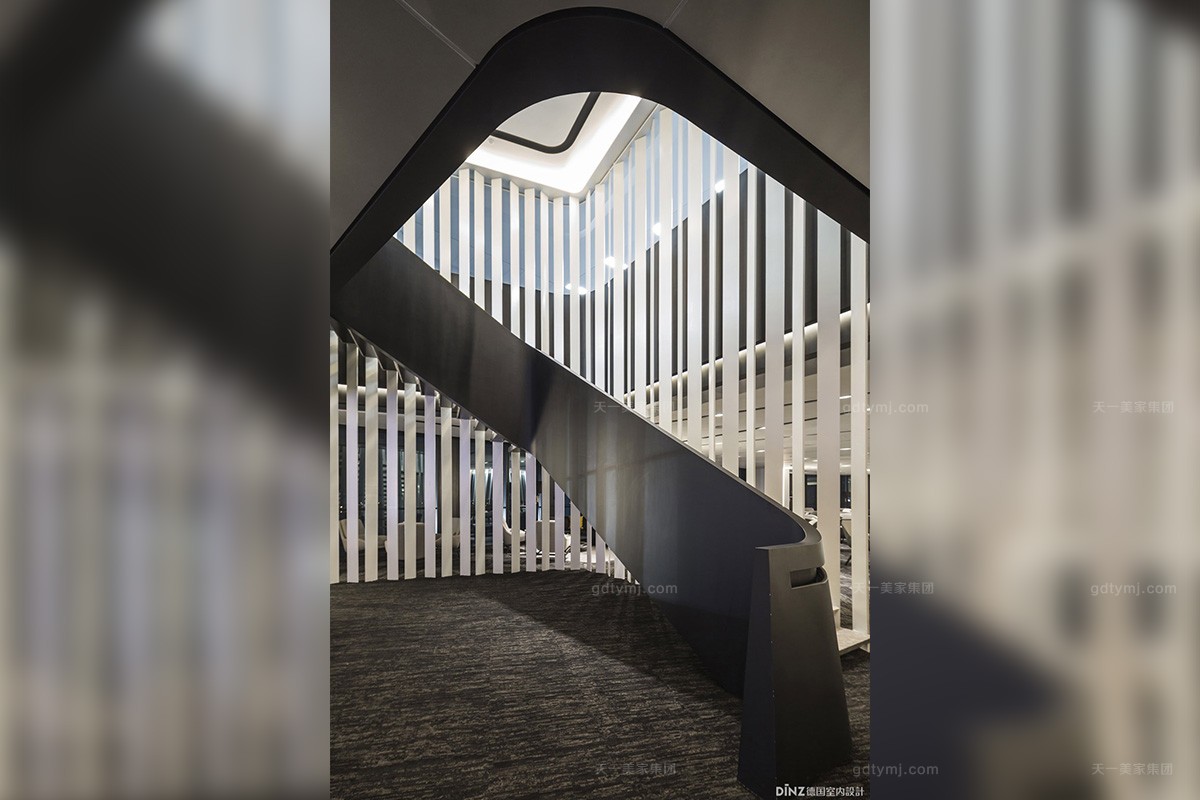
几何线条修饰的立面竖型屏风结合u型楼梯洽谈区以及接待区巧妙的分开,采用尊贵的磨砂黑色搭配简洁流畅,以线条,波浪、黑白搭配形成块面为空间特征,因此灯光着重强调白色立面立体层次感,黑色的部分采用LED线性灯带勾勒U型人流动线。
The facade vertical screen decorated by geometry lines combines with u-type staircase to cleverly separate negotiation area and the reception area. The decoration of valued matte black is simple and smooth, has the spacial feature of block surface formed by lines, waves, black and white. Therefore, the light highlights the white vertical three-dimensional layering and the black part uses the LED linear tape lights to draw the outline of U-shape flow lines.
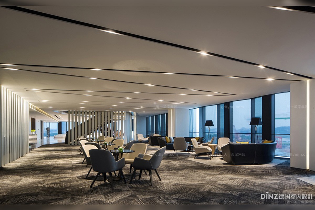
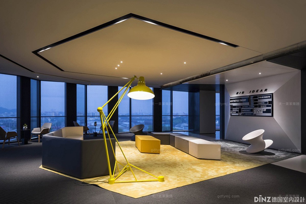
洽谈区摒弃常见的均亮高照度的空间手法,从空间中天花中简约的线条造型结合灯具的位置安装。利用明暗有序的节奏形成随意轻松且私密的洽谈环境。不规则的天花造型对与灯具技术参数的要求需要更加的精准,但是每个桌面的照度都保持一致,不管是从组合式沙发还是在散座区域都能够保持视觉感受的统一。
Negotiation area abandons the common spatial approach of even luminance and high illumination. The installation combines the simple lines on the ceiling in this space with the location of lamps. Orderly arranged light and shade are used to create a casual and intimate negotiating environment. Irregular ceiling modeling has more precise requirements for technical parameters of the lamps, and the illumination of all table tops are the same. Both of the combination sofa and the single seat area can maintain the unity of visual perception.
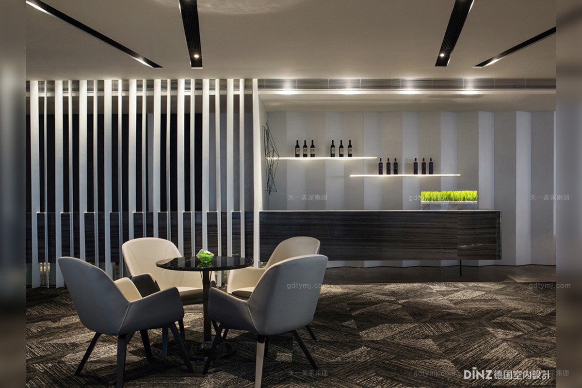
水吧台立面与卫生间洗手台浑然形成一体,为了保持空间天花整洁,走道上没有安装任何灯具,而是统一灯具暗藏在走道与洽谈区天花落差的槽内,采用切光手法满足水吧台与洗手台面照度需求,水吧台背面结合层板用LED线性灯带让层板行程表面发光。从而立面上与水吧台造型相呼应。
Water bar counter facade and toilet washbasin are well-integrated; in order to maintain the ceiling in the space neat, there is no lamp installed in the aisle, but the unified lamps hidden in the trough between the aisle and the ceiling head of chat area; blackout method is adopted to meet the illumination demand of the water bar counter and the washbasin; the back of water bar counter combines with laminate LED linear light belt to make the laminate travel surface glow. Then, the facade can form echo with the water bar counter modeling.
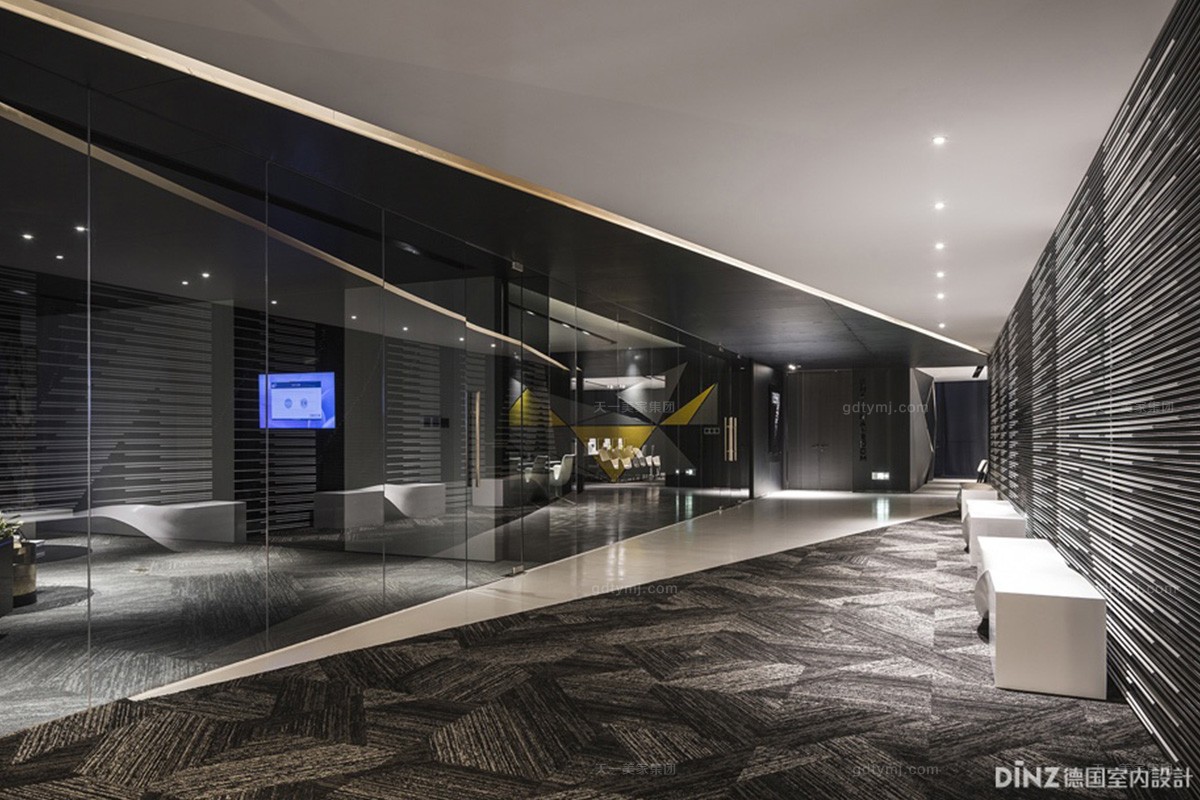
联通走廊采用不规则的斜线对空间进行切分,我司采用线性暗藏灯槽的流线关系指引人流,同时采用不规则的手法选择照亮靠核心筒一面艺术装置区域,而VIP室以及大会议室的一面选择不表现,因此整条走廊就形成了黑白搭配的视觉反差。
The connected corridor is divided into several spaces by irregular slash; we guide the flow of people through the use of the streamline relation of linear hidden light trough, at the same time, we illuminate the art device area by the core tube side via irregular methods, and adopts no method for the VIP room and the conference room sides, then, a black-and-white visual contrast is formed in the whole corridor.
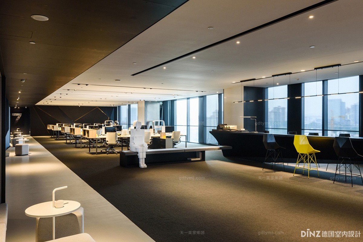
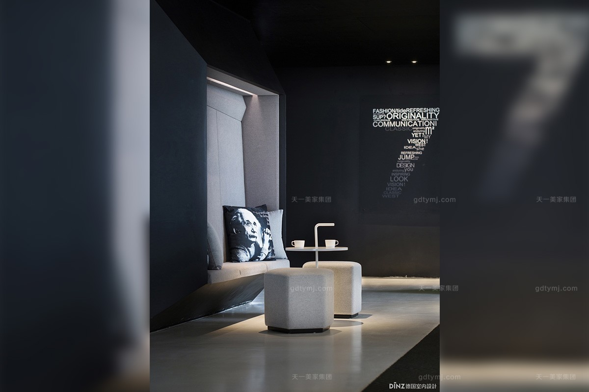
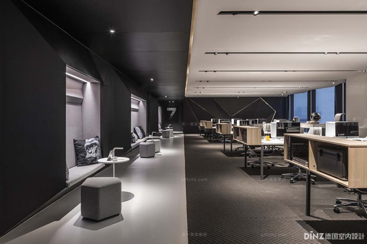
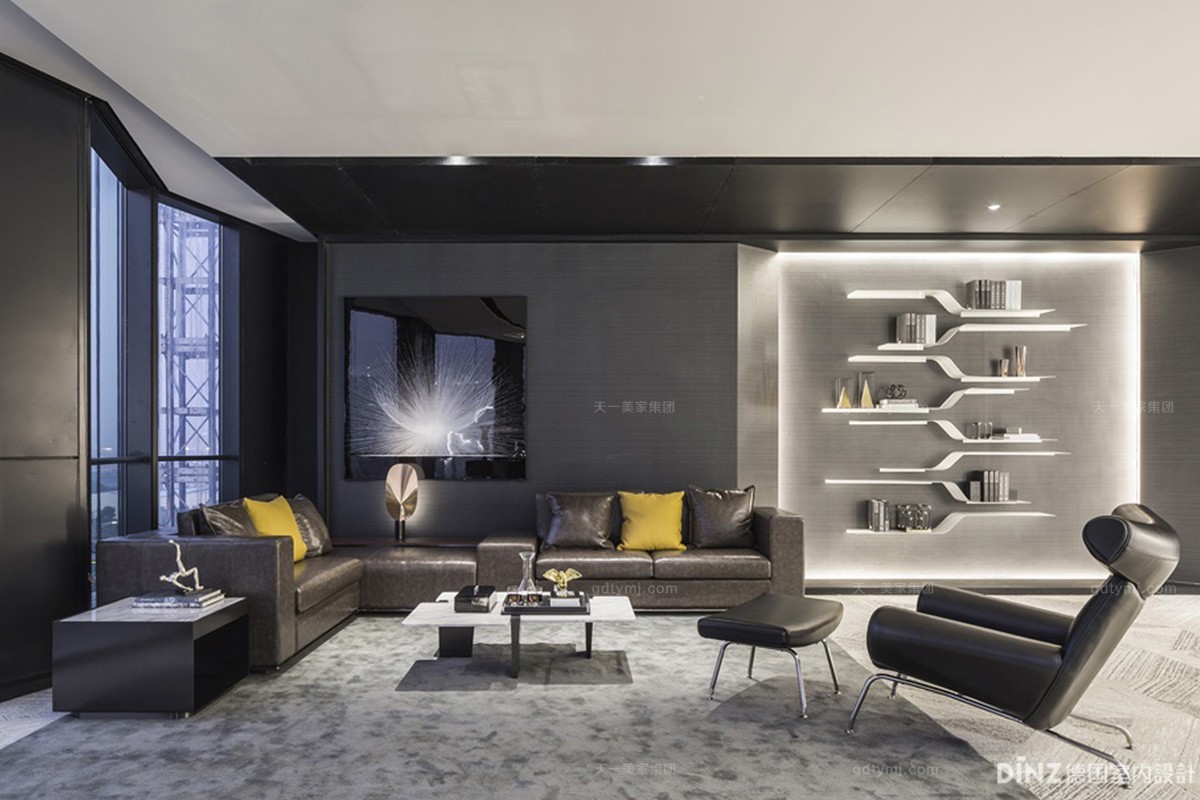
黑漆立面与白色茶几座椅相映成趣,幻化出现代高科技材料的光洁感,酷感十足。深色的地面、白色的天花与黑色立面白色地面,让这个空间一半是肃穆,一半是活泼,营造了一个效率与放松兼得的办公室设计空间。大面积地利用深色材质,与暖白色光搭配将空间的开放式设计体现得淋漓尽致,反映出办公企业运作的公开氛围,给人一种严谨而又不失轻松的职业化形象。
Contrast of black lacquer facade and white table seats creates the smooth texture of modern high-tech materials, which is very cool. The layout of dark ground, white ceiling and black facade and white ground makes the environment solemn but lively, creating an efficient and relaxed office design space. Large use of dark textures and the matching of warm white light have incisively and vividly given expression to the open design of the space, reflecting the open atmosphere of the office enterprise operation and giving a rigorous but relaxed professional image.
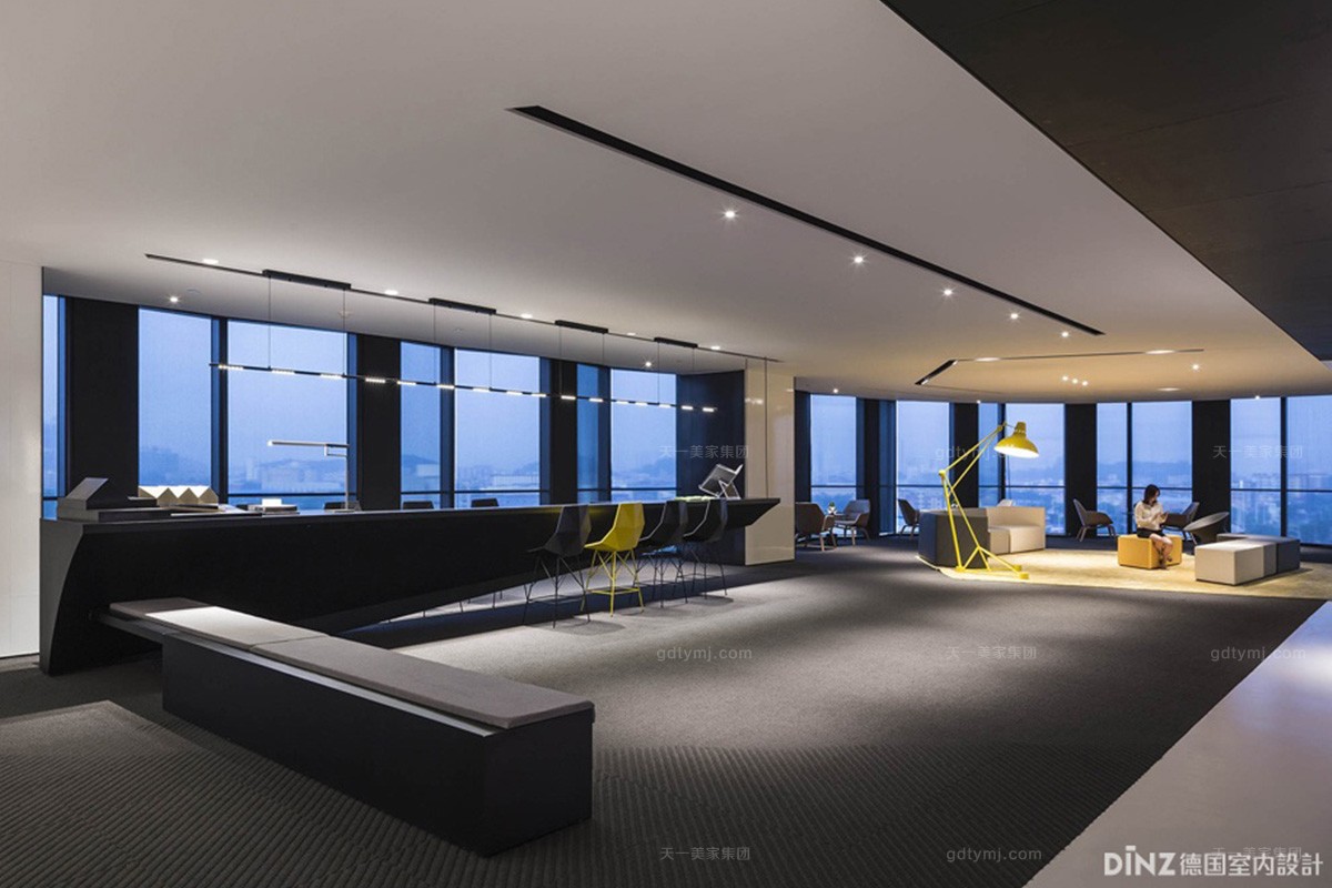
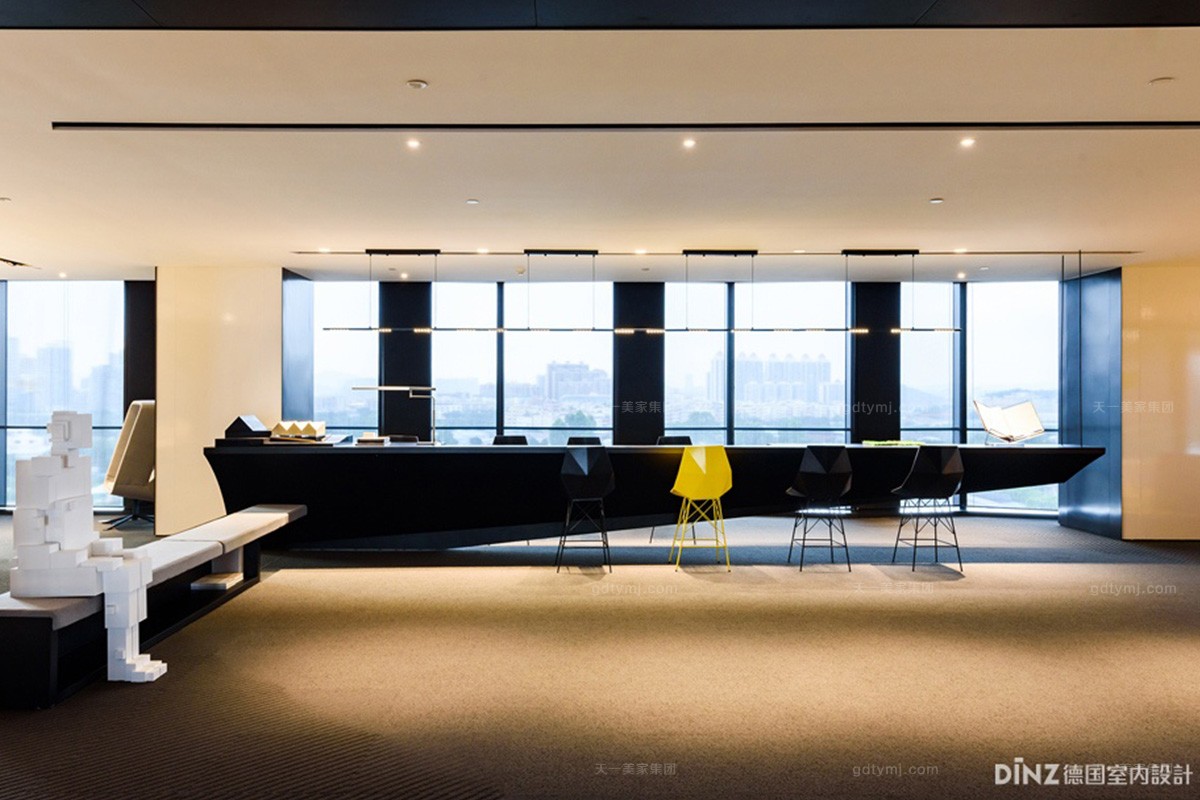
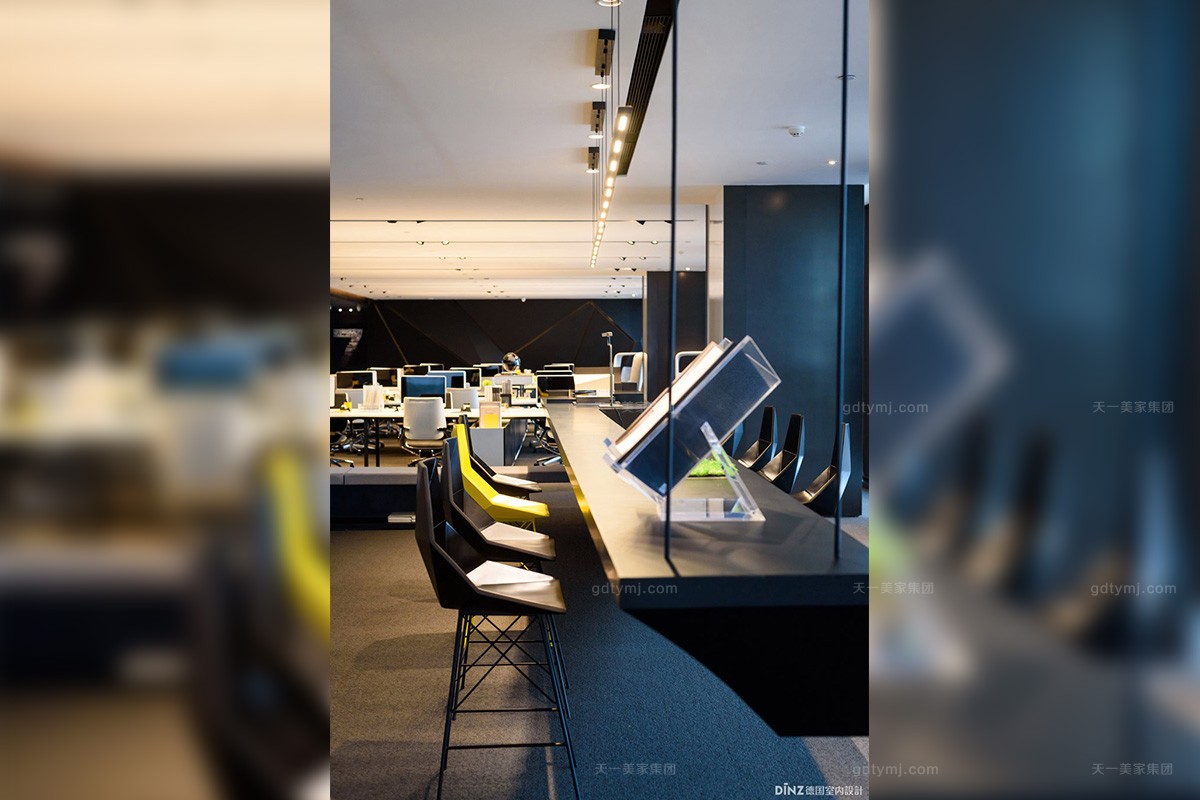
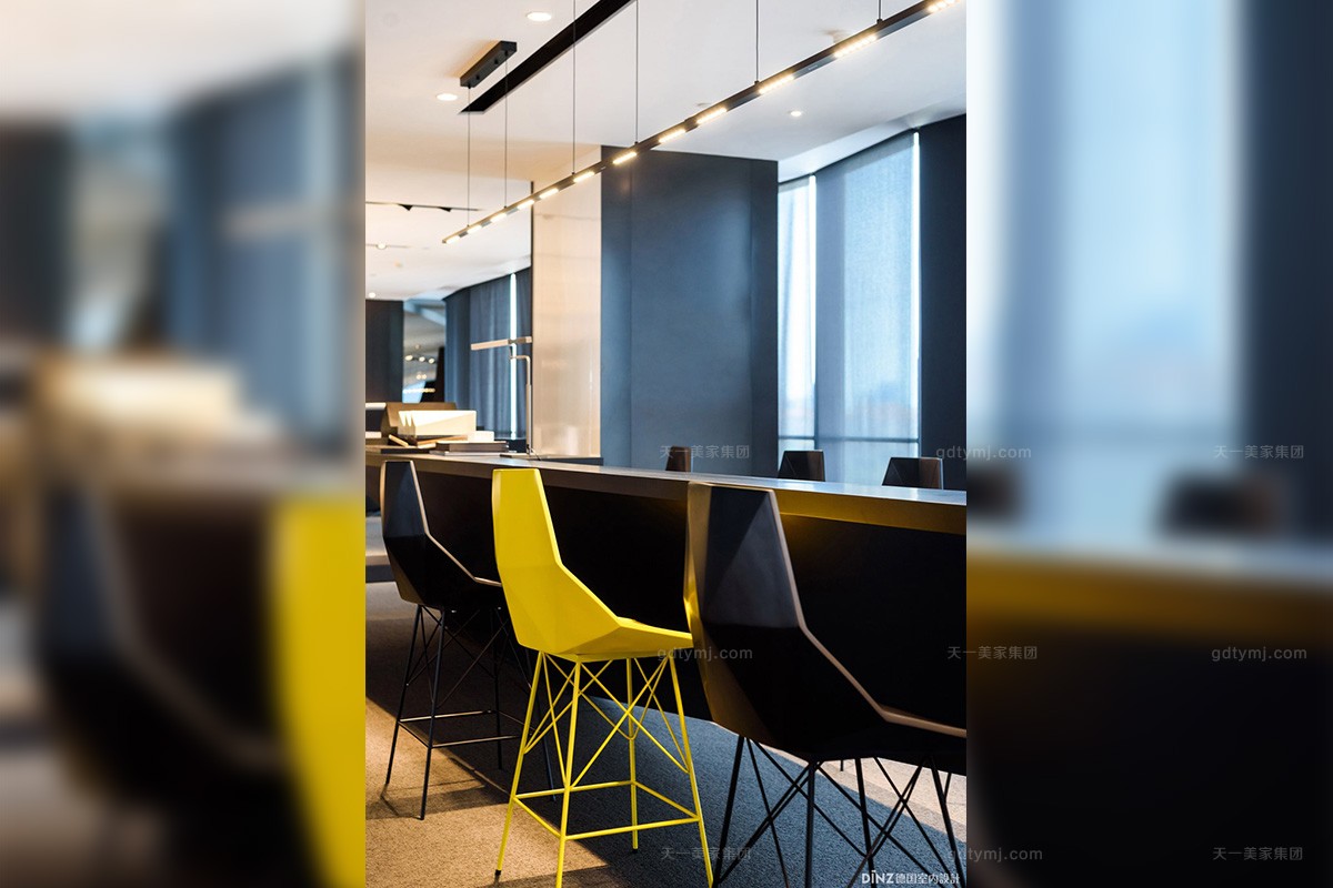
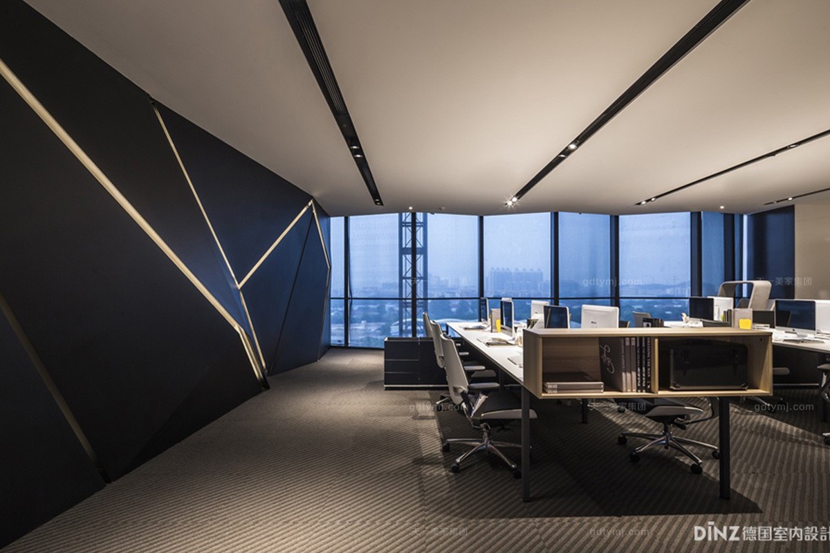
整个创意办公区、没有任何的隔断,利用灯光层次制造出一种视觉的通透感,更有偌大的落地窗,将室外的暖阳引入室内的同时,更是将人们的视野扩展到整个城市,工作闲暇之余,满城风景尽收眼底,“坐看风云变幻”,心胸顿觉舒畅。
The whole creative office area has no partitions, the area creates a sense of visual permeability by the use of lighting levels, what’s more, it is provided with huge French windows, so that it can not only draw the warm sunshine into the room from outside, but also extend people’s vision to the whole city that can enjoy a panoramic view of the city in leisure time: “sit and watch amidst the winds of changes”, with a happy and comfortable mood.
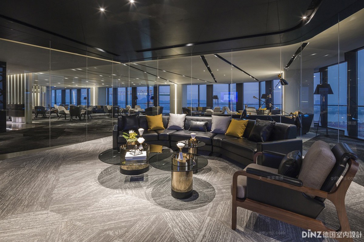
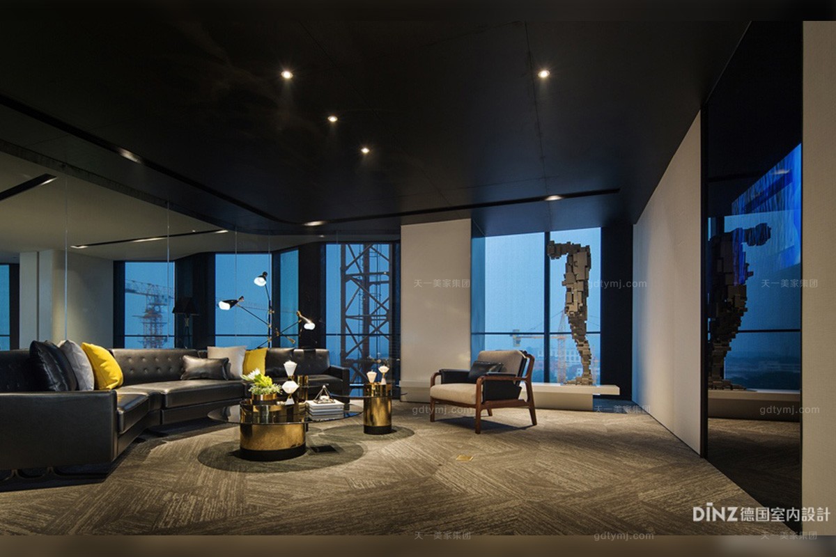
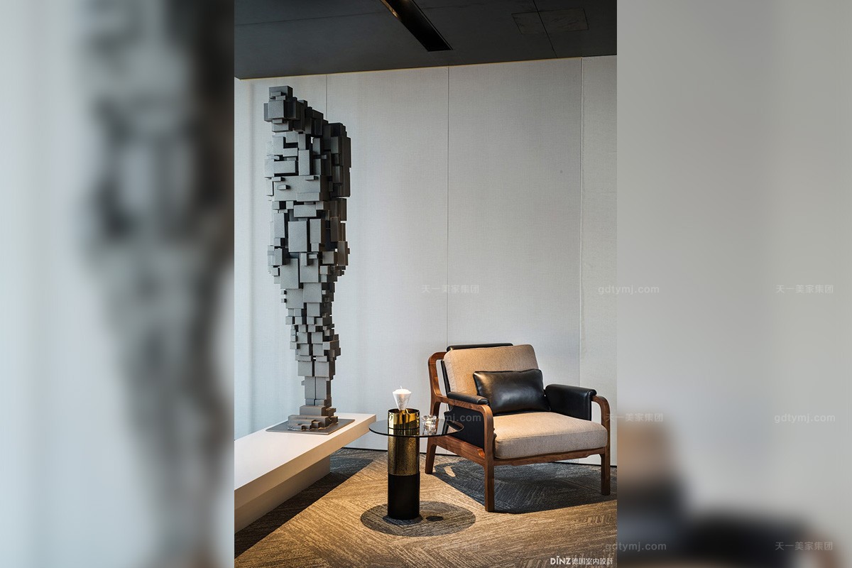
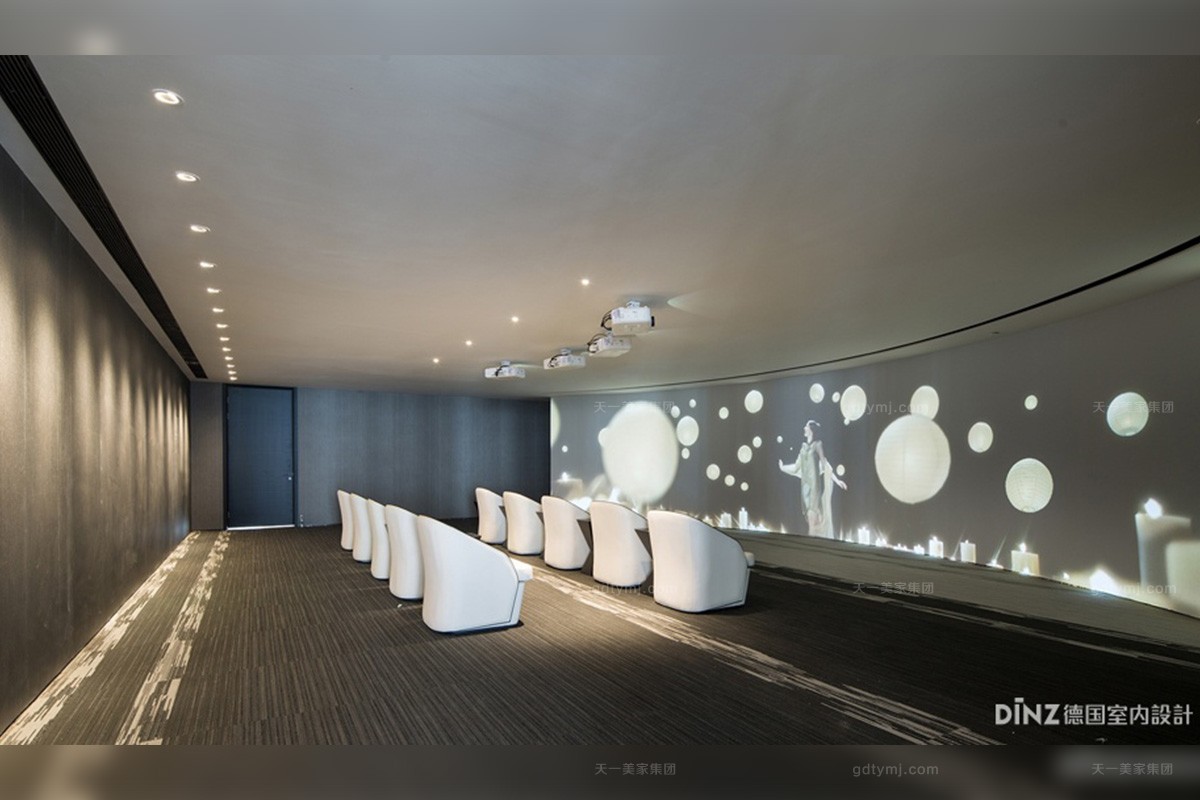
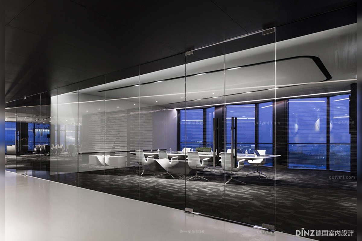
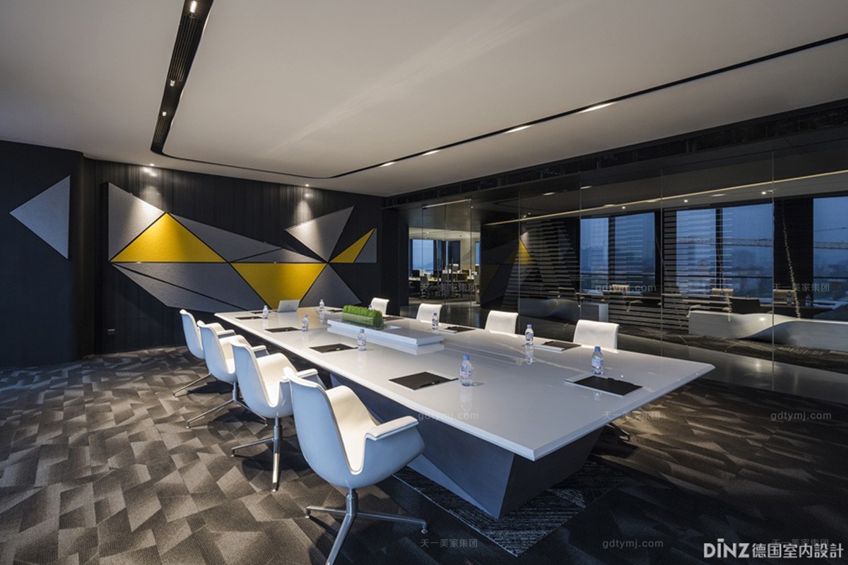
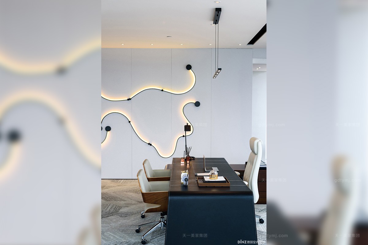
保利鱼珠港办公销售中心,整体营造的是一个黑白空间,辅以亮色装饰点缀,设计简约个性。 在简洁明快,层次分明的基础灯光铺陈下,灯光设计其实着重强调了对每一处精心挑选与布置的艺术品的处理,这些给人惊喜的小角落,与空间点映成趣,为员工营造出了一种充满生机与想象力的工作环境。
Poly Yuzhu Port Office Sales Center is designed as a black-and-white space in the comprehensive construction, supplemented by bright-colored decorations, with a simple and personalized design. Under the expression of the concise and lively, clear and structured basic lighting, lighting design, in fact, has emphasized on the processing of each carefully selected and decorated artwork, and these surprising corners have formed a delightful contrast with the space, creating a work environment filled with vitality and imagination.
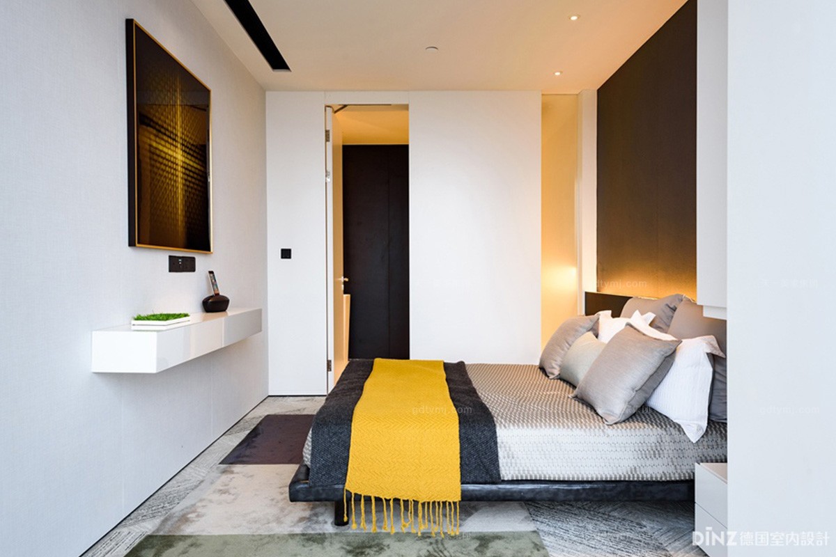
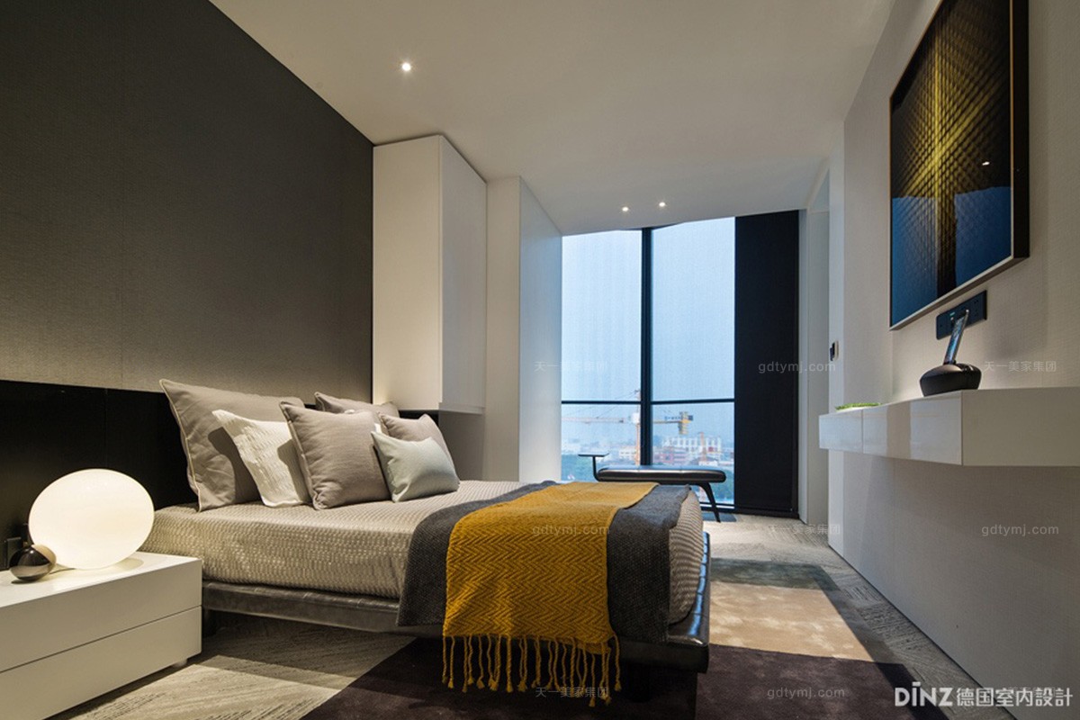
活动家具提供 | 广东天一美家家居集团有限公司
Active Furniture | Guangdong Tianyi Home Group Co., Ltd.(www.gdtymj.com)
灯光设计 | 大观国际设计咨询有限公司
Lighting Design | GD-Lighting Design (www.gd-lightingdesign.com)
灯光设计团队 | 王彦智、任慧、陈凯旋
Lighting Design Team | WANG Yen-Chin, REN Hui, Kiki CHEN
业主 | 保利房地产(集团)股份有限公司
Investor | Poly real estate (group) co. LTD
室内设计 | 广州名艺佳装饰设计有限公司
Interior Design | James Liang & Associates Limited.
软装设计及制作 | 广州市置美优合艺术设计有限公司
Soft Loading Design | Justmine Art Design Co., Ltd.
项目位置 | 广东广州
Location | Guangzhou City, Guangdong Province, China
建筑面积 | 约184414㎡
Floor area | ≈184414㎡
完工时间 | 2017年11月
Completion Time | November 2017
摄影师 | 冯建、林州烯、深圳市视方摄影有限公司
Photographer | FENG Jian,Jossy LIN, Shenzhen Shifang Photography Co., Ltd.
供稿单位 | 大观国际设计咨询有限公司
Text and photos provided by | GD-Lighting Design
--- 责任编辑:天一美家高端家具 -- 彭光发
版权所有http://www.gdtymj.com (天一美家别墅大宅家具) 转载请注明出处